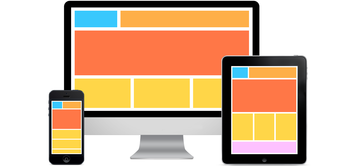
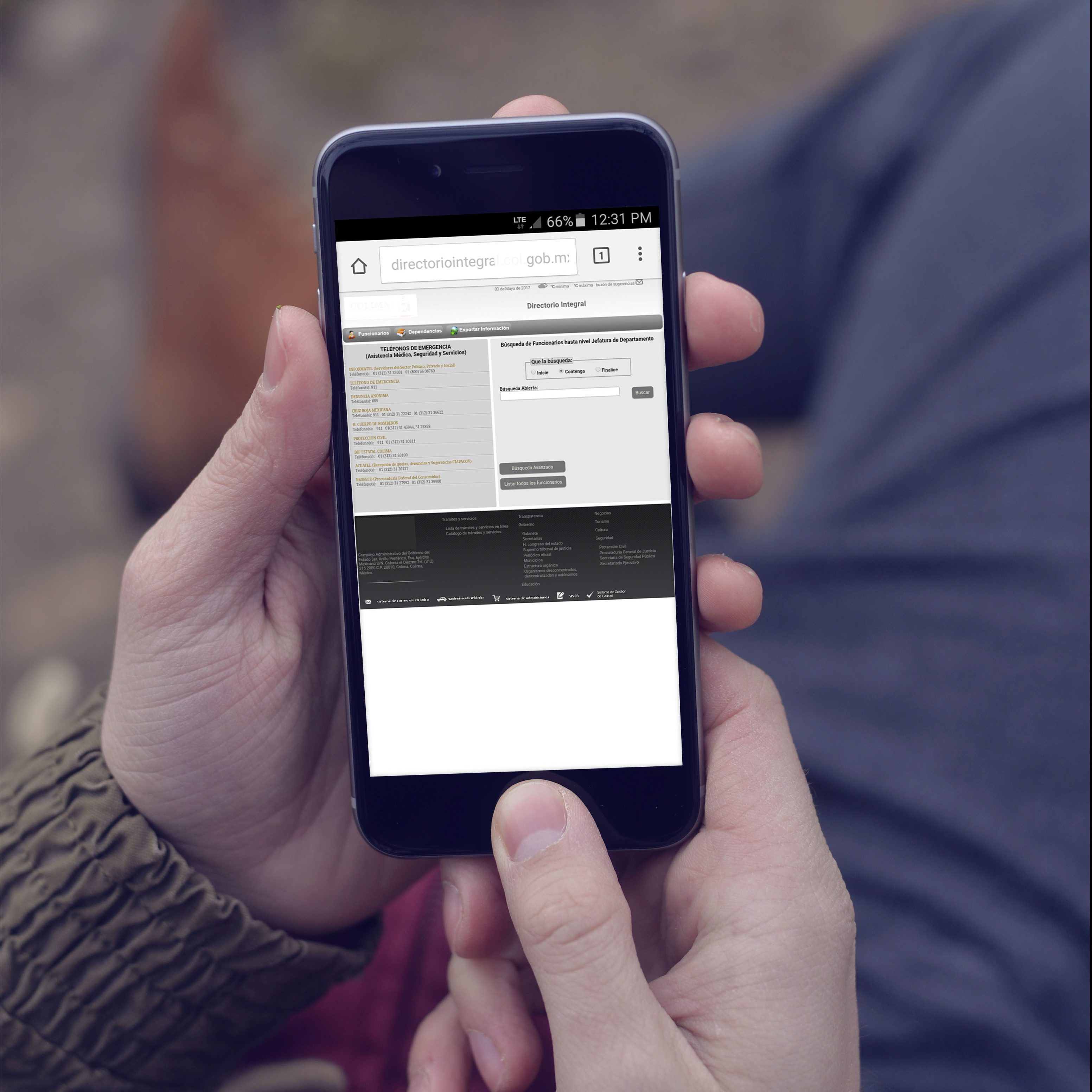
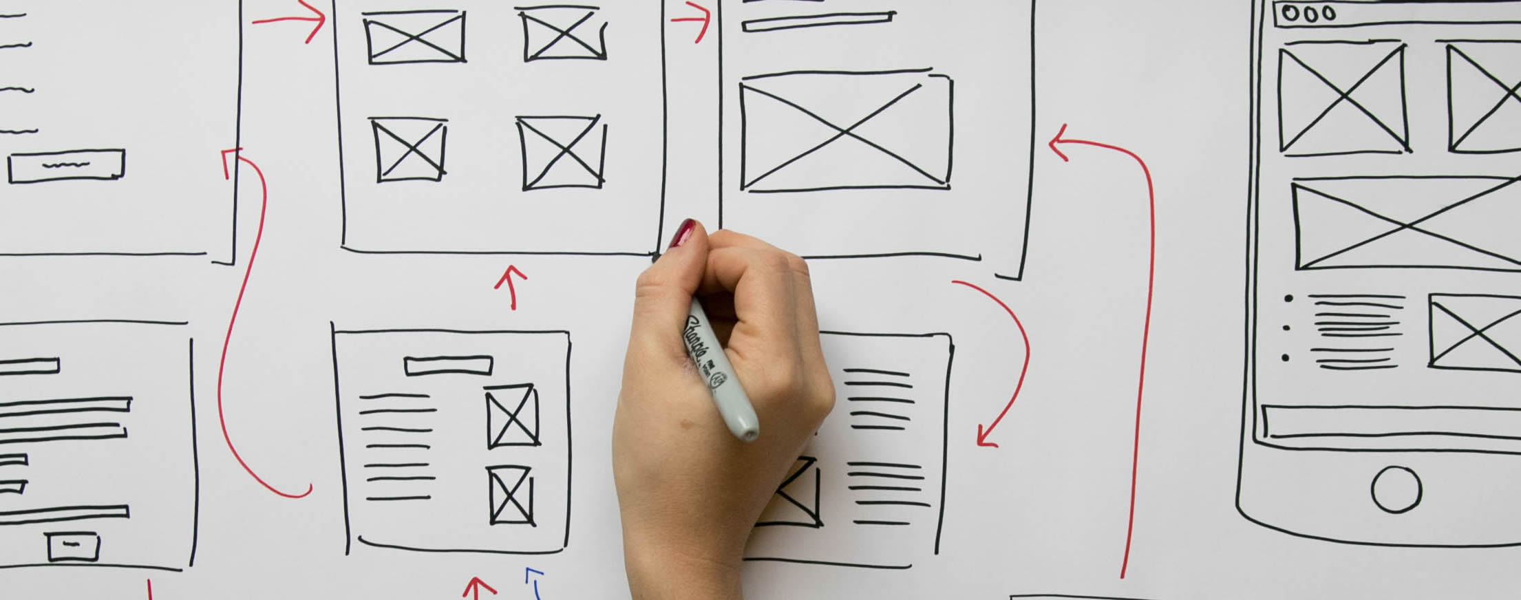
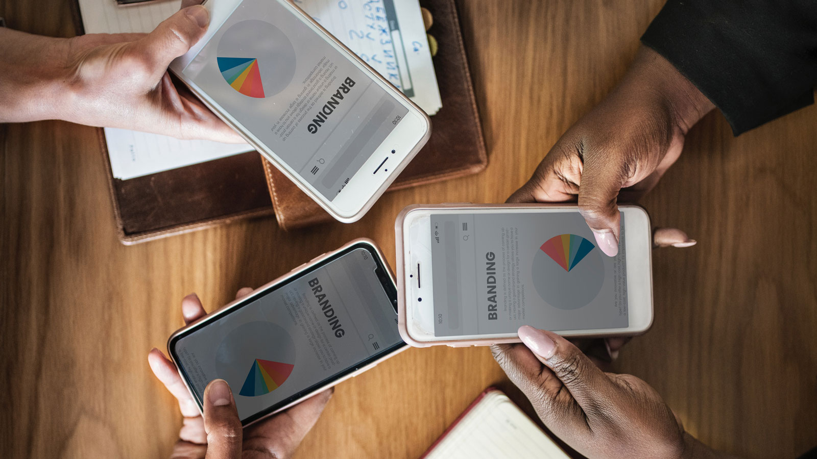
When we talk about User Interface design, we refer to the software that allows users to interact and manipulate elements from a computer or mobile device. It includes visual, aural and tactile aspects that guide a person through a path to make specific actions.
User Interface design has been applied in different types of product design, from operative systems, programs and applications to e-commerce sites.
Thanks to Internet, online shopping has been successful. In the past, physical stores had several limits for customers: tight opening schedule, location, short product display, etc. But now shopping lovers have the benefit of buying products online anytime, anywhere and with a wider variety of items offered.
The way people purchase online has changed over time. With so many software and application choices it is not enough to just to create a website or application and expect people to adopt it and remain a long-term user. Now, developers have to also focus on intuitive and user friendly software that guides the user to a defined action. In the world of e-commerce the most important action for a user to take is to make a purchase. Three of the must-have user interface design elements that MagmaLabs recommend as a necessity for every e-commerce site are: High Quality Images, Clear Call To Actions and the use of Seamless Checkouts. If you want to improve the online shopping experience you should consider these elements to get shoppers to buy your products.
User interface design evolves constantly and changes according to the online shopper profile. There are different elements that need to adapt to the new ways of technology interaction. As an e-commerce and software consultancy we like to think we fuse cutting innovation with best practices. Therefore, below are three user interface trends we’re seeing in e-commerce interface design.
What’s Hot in E-commerce Interface Design
Hamburger Menu: This trend tends to hide the entire navigation menu into an icon, usually in the form of three horizontal lines stacked together; when you click it, it reveals the entire menu.

PROS
- Saves a lot of space
- Very useful for mobile
- t’s familiar for the actual user because, as a trend, more and more sites include it on their UI design.
CONS
- It hides the main navigation, which sometimes works better if always available for the user
- It represents more cognitive load for the user since it has to consciously look for a way to navigate through the site. If a user isn’t familiar with it because he hasn’t interacted with the design element before, it can hinder the user navigation experience.
Where we think the trend is going:
- More and more sites are adapting this trend for their navigation so it would be easy to say that the trend is going to hold up for some time, but after the hype ends and as web design keeps developing, a new trend will come soon to replace this way of ‘saving space’, for example contextual navigation.
Long scroll: This trend is about having only one page work as the entire site. This trend is becoming more and more common on e-commerce sites that sell services. It easily organizes the information and forms to fill in if there is a lot of data needed to display.

PROS
- There’s no need for the user to navigate to other pages since all the content needed is contained in the same place.
- Storytelling is a very compelling way to attract users and is one of the most used techniques on one-page applications.
CONS
- Since it’s just one place to put all the information it can get very long and heavy for the user to digest.
- Not a one-solution-fits-all type
- The story told throughout the site must be really compelling to make the user scroll through the end.
Where we think the trend is going:
- The trend is becoming really popular because it’s working for some sites but soon will come something new that takes on all the trends that are currently rocking.
Hero images: This trend is about placing a big image as the first section of the landing page, this images tend to be high quality and very colorful to attract all the attention and are usually accompanied with a tagline and a call to action. With this elements, the user is clearly persuaded to make a desired action. Visual impact causes a huge impact to engage the shopper and make him navigate over the site.

PROS
- It’s very easy to attract the attention of the user since it’s the first thing they will see on the site
- The image and the text are a great way to tell the user what’s the site about
CONS
- This has become one of the most used structures and so many of the sites that are online look alike
- If the images or text aren’t well aligned with the message that the site is trying to convey, it can attract the wrong audience or make the target audience drop rapidly
Where we think the trend is going:
- As the trend starts growing, business and companies will start thinking out of the box to create unique experiences that improve the user engagement with the content of the site.
In MagmaLabs, we like to be aware of the latest trends in user interface design to analyze new opportunities that enhance our product design and development of e-commerce websites and apps. When it comes to trends, it’s always important to think of personalization and actualization. Maybe a current trend is very popular but it doesn’t fit your type of product or service offer. Possibly the boom of the trend is coming to its end or it’s been replaced with a new one. Which UI trend have you applied on your e-commerce store? Was it effective?
