Before I started working at this company as a QA tester, I worked as a graphic designer doing some editorial content. At that time, I thought being a QA wouldn’t be that different from being a designer and that the same principles of editorial design could be applied to web design, it was later when I realized that only some principles are related.
The main differences are that printed, the items do not interact with each other, and on the web, you must understand customer habits – how they move through the website and how they interact with the information. It’s not just about how users read content. It’s about how people feel when they’re interacting with your website or application, and if it’s easy for them to use. This is where User Experience (UX) takes place.
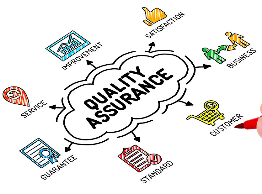
And that was the missing piece I had to learn and has helped me a lot. Although it seems very obvious, there are a lot of people who don’t understand how UX can be applied to QA. For all starters out here, let me tell you that we are not only dedicated to finding bugs, much of our work involves revising that what was developed actually reflects the intent of the delivered design. Some of the activities we do include: revising the look and feel, testing usability, and checking content clarity (among other things). In this way, we make sure that at the end of the project the design has been correctly applied because it follows the requirements previously defined.
How have I been applying my UX knowledge to my QA position?
- Writing User Stories: These scenarios tend to focus on user actions (e.g. “As a new customer, I want to be able to sign in the site.”) and we have to wear the user’s shoes and look at the design from their viewpoint, thinking in various ways to use the site and not only following a “happy path”. This technique helps revealing issues nobody has thought about.
- Verify the integrity of the site: Not only testing specific cases, but how pages load, how interactions behave, and if the site is accessible and easy to use. It is also important to verify if the user can navigate through the whole site from page to page without facing any problems.
- Reading content: While content revising occurs prior to final QA, we can check how communication is delivered throughout the experience. We must read all the information on the site making sure the text is easy to skim, the copy is clear, concise, helpful, and makes sense. We should try to trigger all interactions on the site to see how communication is taking place with the user. Validate that errors messages provide the appropriate feedback and don’t interfere with the experience.
- Responsive design: Verifying the behavior of the site in different resolutions whereas it’s desktop or mobile devices. Check if the flow changes and the experience gets interrupted. Identifying broken layouts like if a chunk of the page is being cut off and other elements are not being displayed correctly.
The UX is not finished even when the design team has delivered its work, and the product is already being developed. There are some elements that need to be revised during the development process before the final product is delivered and this is why team collaboration is so important.
Learn more about MagmaLabs!


