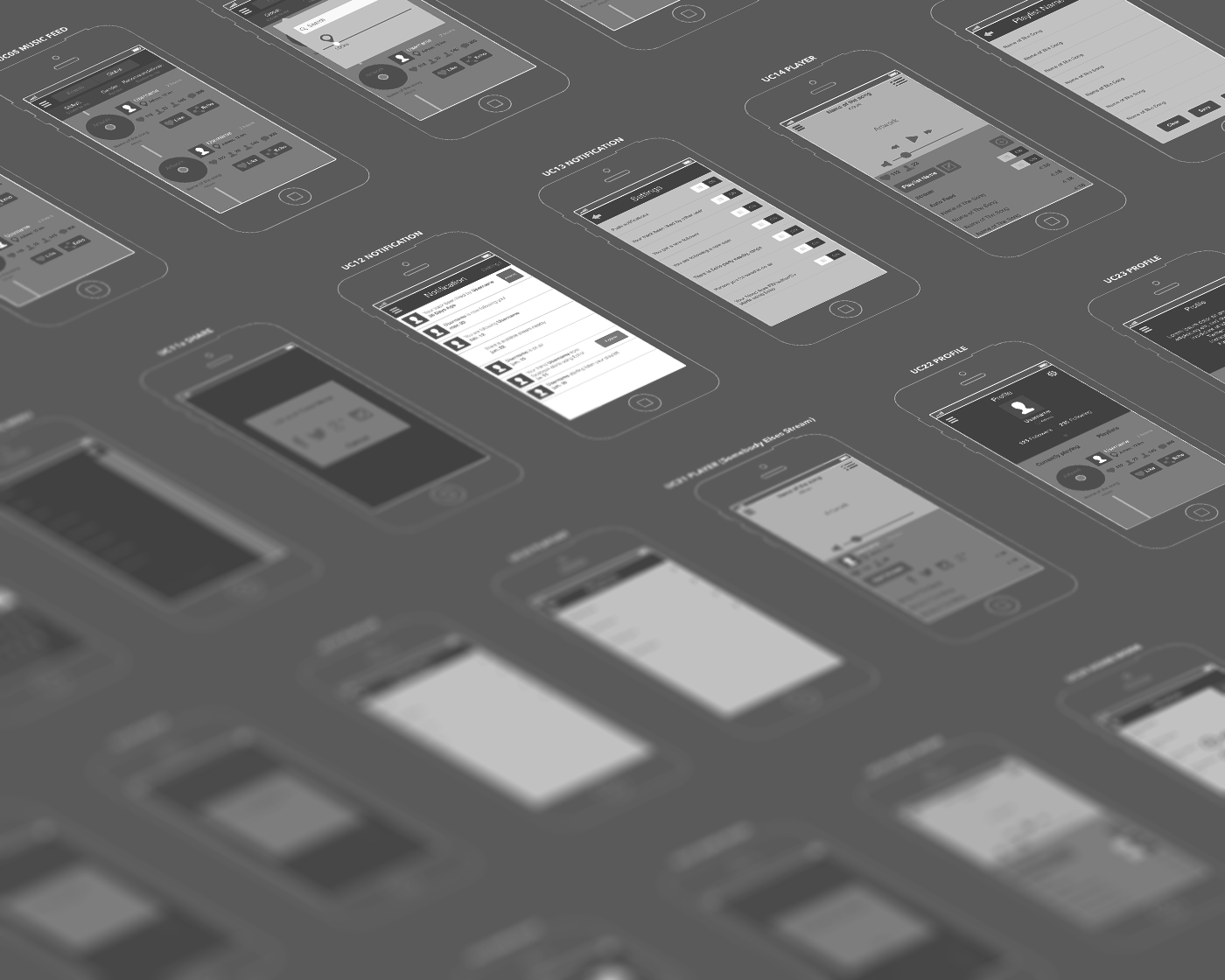
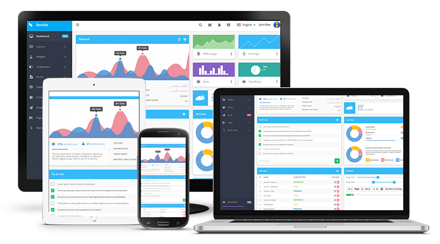
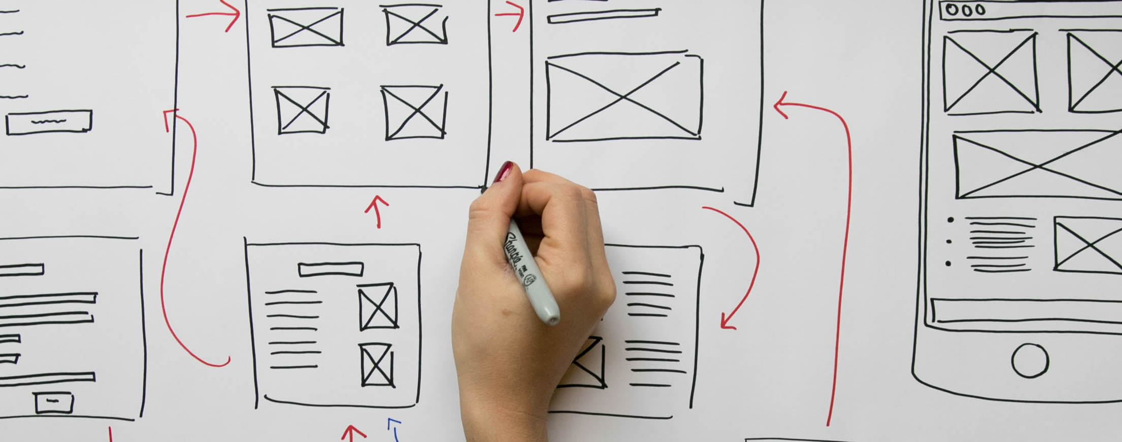
What makes an interface clean, tidy, and nice-looking? The answer to that question would the dialogue coherence of the elements which compose it. When we look at a page that has a rhythm among spaces, a cadence in the elements, and gives us a feeling of easy reading is because it probably has been designed while using a grid system.
A grid system is a way to divide a canvas in order to compose the elements in an orderly manner. And while there are many ways to build a grid, using the 8pt base for its elaboration is convenient since it gives cadence and consistency to our designs.
But, why 8 points?
The variety of screens in their resolutions and pixel density has changed over time and this makes the work more complicated for designers when considering responsive designs. Fortunately, the use of an even number like ‘8’ to define the design elements and the spaces among them makes it easier to adapt to the sizes of popular resolutions, therefore it is more consistent since they are divisible by 8.

And how does this work?
Basically, it consists of looking for the smallest elements (atoms) such as buttons, images, text boxes, lines, even the components that are generated when grouping several base elements (molecules, organisms) of our design, then they are separated and measured in multiples of 8.
Let’s see some examples:

In this comparison, we can see the 8 pt system of what might be a form, while the other design uses arbitrary heights to space and dimension the elements.
Is it becoming clearer, isn’t it? Let’s look at another example:

In this case of a button, the padding of 8 px is in relation to four times 8 (32px).

This one is about an information card where the elements maintain the same relationship and harmony in the separations using the 8 pt system.
But, what are the advantages of it?
For designers: it maintains the rhythm and coherence among elements, facilitating design decision making
For developers: It improves communication with designers as they can easily observe the 8-point-increment model.
For users: it generates a better reading comprehension in the site, and it creates a friendly, neat, and aesthetic experience.
In summary
At MagmaLabs we believe that using the 8-Point Grid System helps to:
- Improve the readability of the site
- Have a more consistent user experience
- Eliminate confusion in the face of design and development decisions
- Provide a clear visual hierarchy
In addition, it is scalable and replicable.
In simpler words, Designs will look much better!


