What is the best UX practice when you need to create a mobile design?…no, adaptive and responsive isn’t the answer, you can use that, but it isn’t the best practice.
I got inspired to write this post, after visiting some websites on my cell phone and having a bad experience. Some had very small letters or the menu in desktop scale, other ones offer you contact numbers but you can’t call directly, instead you had to leave the site and dial it directly. These issues led me to read more about mobile design, and the recommendations to create mobile-first sites.
These are 4 best practices for mobile UX design that we use in MagmaLabs for mobile apps and m-commerce:
1. CALL TO ACTION BUTTONS

All buttons that carry action will be visible and positioned strategically. The advantage of the mobile design is that you can use more tools such as making a call directly, using the GPS, the cam in two different forms or to scan things, visualize 3D things and virtual reality.
It’s worth mentioning how important it is to keep in mind that the device we are designing for, is touch. So for example, a delete button with “hover” won’t be active or useful to the touch. It’s also interesting to explore the functions of the touch since there is a wide variety like: click, hold, slide, expand or minimize.
2. HAMBURGER MENU

Generally, we use the burger icon for the menu because simplification is better for mobile UX design. Users don’t have the patience to check a long list of options so avoid to design a scroll menu, instead, divide the tasks to easy form, everything must be clear.
You can use allusive icons for the link, this can be most helpful to the user, as long as the icon has an obvious relationship or is very clear of what it is. For example, the user already relates a gear with the “settings or configuration”, however you can use the personalized gear for the design that you are working on. In the case of a hamburger menu, there usually use 3 lines or 3 points depending on the design.
4. RETURN TO HOME

The interface of iOS and Android is very different so, it’s I recommend using always the logo to return to home. I mean, when the steps are advanced in a timely manner, you can return with an arrow or indicator that looks to the left, however, when the user is lost or is definitely looking for something else, the quickest exit is the return to the beginning, to start over.
5. PROMOTIONS OR POP-UPS:

When using a promo on the site, you should care about the balance between getting noticed and stealing attention. You must define a strategic space as well as the design, which does not compete with the entire site. If you are thinking of using a pop-up to promote something or give a warning, make sure that you have the close button very present and that in terms of its importance, you consider removing it, or keep it in another place. In the case of a notification, it could be a brief one with the possibility of closing (x) and consider a small signal near the logo, burger icon or in the section where you are informed of an action.
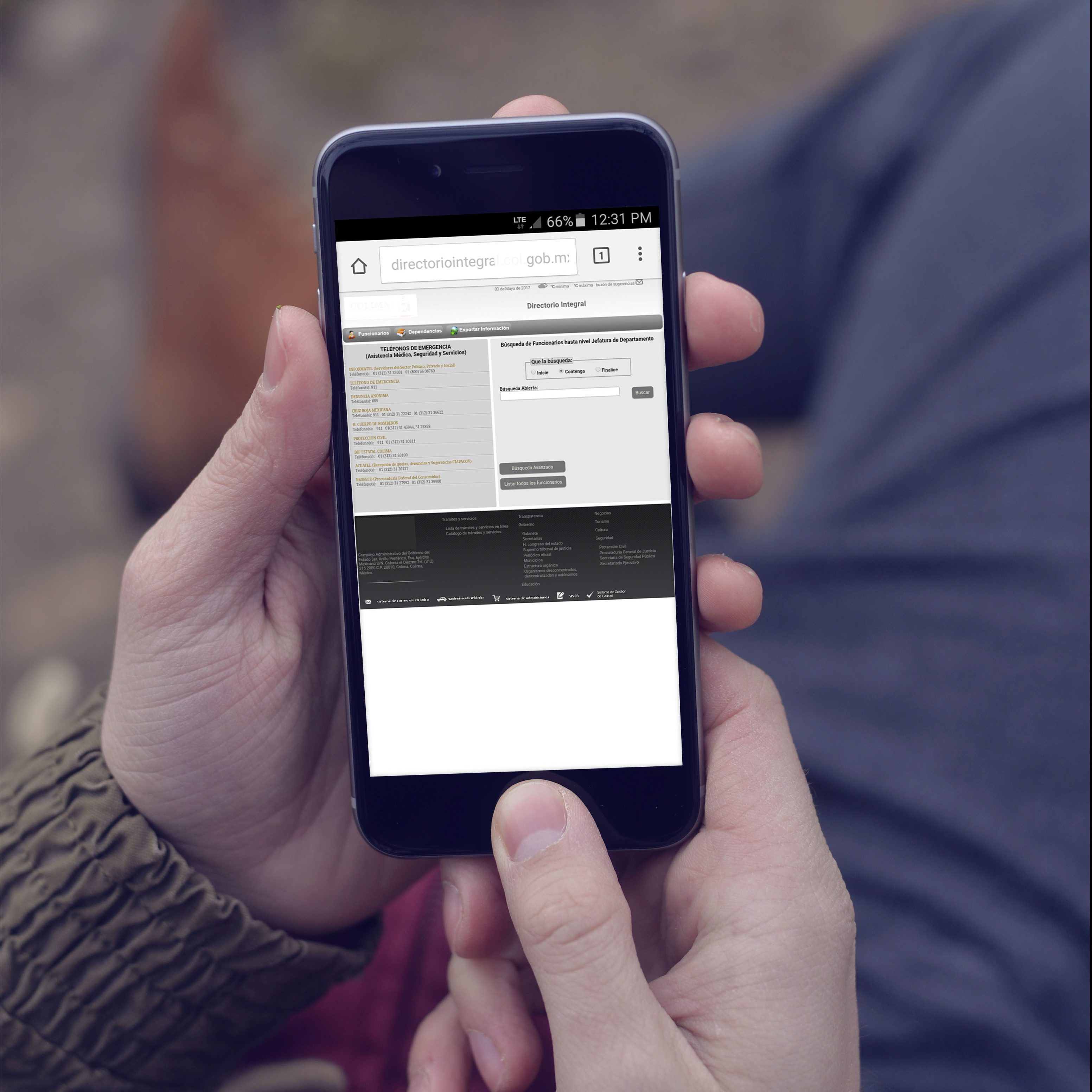
Note that the full-screen is not always as functional as we see it in the prototype or wireframe. Consider the wide variety of sizes of mobile devices (example: 170px, 240px, 320px, 360px, 480px, 600px).
To finish, I recommend that if you feel a little lost or you don’t have inspiration, surf a little on social media networks…but NOT to see what is new in the lives of others, just to check how designers solved the problem that you are facing with your design. If you have colleagues or better yet, colleagues who aren’t from the area, take advantage of it and do a mini test of how will they navigate the mobile prototype that you have so you can discover how well your design is.