In this post, I’m going to give you some quick tips while you work with bootstrap.
I was not sure what kind of tips could be useful for you so I tried to answer some of the most requested, so if you want to ask about something else don’t hesitate and ask in the comments below or even better if you come up with more useful tips that would be awesome.
1. Center columns horizontal: Display inline-block
- Columns by default has
float: left;but to center our columns we need to override that style withfloat: none;. - The next step is center our items, we can do that adding a
.text-centerto our container. - To make it work our items will need a
display: inline-block; - There is just a detail, if you have 12 columns the line will break (example), in order to fix this we need to make a small hack, just set the font of the container to 0, and inside the items return the right font size.
CSS
.fl-no { float: none; }
.dis-ib { display: inline-block; }
.font0 { font-size: 0; }
.font14 { font-size: 14px; }
HTMLColumn 4, float none, display inline blockColumn 4, float none, display inline blockColumn 4, float none, display inline blockColumn 4, float none, display inline block
Example: jsfiddle

2. Center columns vertical: Vertical align middle
- We need to remove the
float: left - Also we will set the
display: inline-block; - To align vertically this time we will include the
vertical-align: middle; - Similar to the first tip, we need a small hack to make our 12 columns align correctly (example with broken line), setting the container to
font-size: 0and giving back the right size in the items will do the trick.
CSS
.center-vertical {
  display: inline-block;
  float: none;
  vertical-align: middle;
}
.font0 { font-size: 0; }
.font14 { font-size: 14px; }
HTMLContentContentContent
Example: jsfiddle
3. Center columns vertical: Flex
- To use flex we need to set our container to use it with
display: flex; - Once done that we need to set how our items will be aligned with
align-items: center; - To allow our container to have multiple lines of content we set the
flex-wrap: wrap;
CSS
.vertical-align {
  display: flex;
  align-items: center;
  flex-wrap: wrap;
}
HTMLContentContentContent
Example: jsfiddle

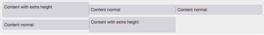
3. Make columns same height: Flex
- Our container or row must have a
display: flex;andflex: wrap; - Our columns should have the
display: flex;andflex-direction: column; - Check the example for full cross browser support.
CSS
.dis-fl {
  display: flex;
  flex-wrap: wrap;
}

.col-flex {
  display: flex;
  flex-direction: column;
}
HTMLContentContentContentColumn
with two paragraph
Column 4
Column 4
Column 4
Column
with two paragraph
Example: jsfiddle

4. Align buttons and inputs
There are multiple options to align buttons and inputs, you can check the defaults for bootstrap in its documentation.
But if you want to achieve this in a more classic way, you can make it like this:
CSS
.input-container-inline {
  display: inline-block;
  margin-bottom: 0;
  vertical-align: middle;
}
HTML div class="container-fluid">
Example: jsfiddle

5. Center responsive images
This was one of the most common questions, and it’s a bit weird because this is included in the documentation.
But to achieve that you can use the center-block class.
HTML
Example: jsfiddle

6. Five columns
Instead of having bootstrap with a different amount of columns we are going to extend the functionality of bootstrap.
Using the same concept of columns we are going to create our column of width: 20%;
This column will work exactly as any bootstrap column.
CSS
.col20-xs, .col20-sm, .col20-md, .col20-lg {
  position: relative;
  min-height: 1px;
  padding-right: 15px;
  padding-left: 15px;
  float: left;
}

.col20-xs { width: 20%; }

@media (min-width: 768px) {
  .col20-sm { width: 20%; }
}

@media (min-width: 992px) {
  .col20-md { width: 20%; }
}

@media (min-width: 1200px) {
  .col20-lg { width: 20%; }
}
HTMLColumn 20%Column 20%Column 20%Column 20%Column 20%
Example: jsfiddle

As this column works exactly as the others you can combine them, for example, in large screens, you can have a 5 columns row, and for mobile, you can change it for a 1 column row (example).
Large screens view (XS >)

Small screens view (XS)

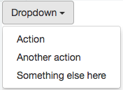
7. Dropdown on hover
By default Bootstrap doesn’t open dropdowns on hover and respecting that our solution will not apply to all dropdowns, it will only apply to the dropdowns you select.
- You need a container for your dropdown (we called it
.dropdown-on-hover) - It changes the display property of the menu when you hover the element (with CSS)
- As the dropdown and menu have a small separation (2px) when you try to select an item the menu disappear, to avoid that we include a padding in our container, so the hover is not lost.
CSS
.dropdown-on-hover {
  padding-bottom: 2px;
}

.dropdown-on-hover:hover .dropdown-menu {
  display: block;
}
HTMLExample: jsfiddle
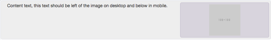
8. Change column order depending on screens
Let’s use an example for this, there are times when the design for desktop displays our text on the right and the image on the left, but for mobile that image will be on top and our text below.
The problem with this is the way columns work, having an order like that for desktop will make the image display below our text on mobile.
Solution: Using the float, in our advantage we just need to invert the float for mobile screens making
CSS @media (min-width: 768px) { .pull-right-sm { float: right; } }HTMLContent text, this text should be left of the iamge on desktop and below in mobile.Example: jsfiddle
Large screens view (SM >)
Small screens view (XS)
NOTE:
Some of those problems have even more solutions than the ones we used here if you have questions, more tips or improved version of this let us know in the comments below.